

OVERVIEW
Bigbadbikes.com is a retailer for aftermarket motorcycle accessories and products. Entering a new emerging motorcycle market in India, they had to stand out and seem more professional and inherently not local (read as Indian) to be taken seriously. The direction Big bad bikes is taking is that of being an influencer (Someone whose knowledge is reliable enough to be the go-to person in the biker community). The company had to look clean and polished while imparting the right attitude to a predominantly hobbyist market.
MADE AT : Lazaro Advertising Pvt Ld.
CLIENT : Big Bad Bikes
Form Exploration
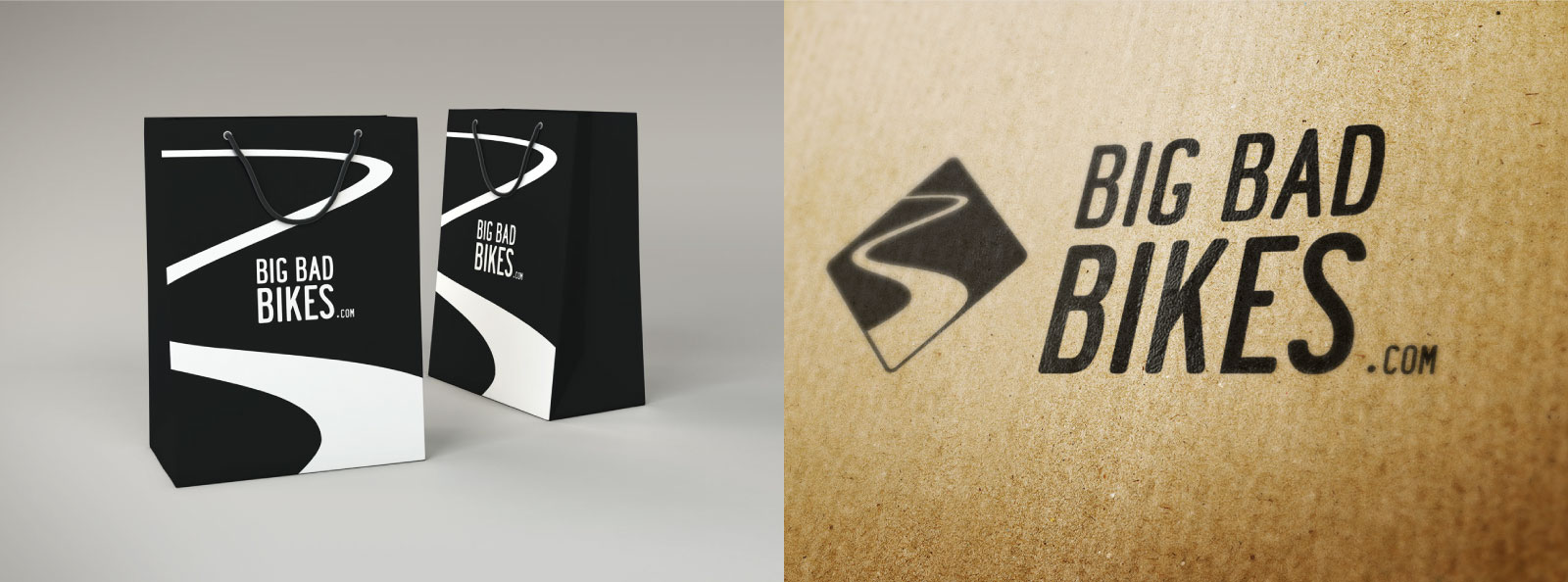
When designing a brand the logo has to identify with the head stakeholders of the company and the essence of what the company stands for.
In this case, Sean Alexander started Big bad bikes as a way to spend all his time working on his passion for motorbikes and adventure touring. ‘A love for the road’ so to speak. In one of the initial meetings with Sean, he spoke about how the winding road sign was something special to him because of the joy that the road was going to offer up by being able to push the limits of the vehicle he was riding.
LOGOMARK

LOGOTYPE
Carrying the theme of street signs forward, I used this font as the base for the Big Bad Bikes Logotype. This served as a clear and legible font for the brand logotype.


PREVIOUS PROJECT
Lendable Marketplace
FIN-TECH | BRAND IDENTITY | VISUAL DESIGN
NEXT PROJECT
Living Walls
REAL-ESTATE | WEB DESIGN | UI DESIGN